reading-notes
https://faroukibrahim-fii.github.io/reading-notes/
Forms and Events
Forms
Why Forms?
The best known form on the web is probably the search box that sits right in the middle of Google’s homepage.
Form Controls
There are several types of form controls that you can use to collect information from visitors to your site.
- ADDING TEXT
- Making Choices
- Submitting Forms:
- Uploading Files:
How Forms Work
- A user fills in a form and then presses a button to submit the information to the server.
- The name of each form control is sent to the server along with the value the user enters or selects.
- The server processes the information using a programming language such as PHP, C#, VB.net, or Java. It may also store the information in a database.
- The server creates a new page to send back to the browser based on the information received.
Form Structure
-
<form>Form controls live inside a<form>element. This element should always carry the action attribute and will usually have a method and id attribute too. -
action Every
<form>element requires an action attribute. Its value is the URL for the page on the server that will receive the information in the form when it is submitted. -
method Forms can be sent using one of two methods: get or post.
Text Input
-
<input>The<input>element is used to create several different form controls. The value of the type attribute determines what kind of input they will be creating. -
type=”text” When the type attribute has a value of text, it creates a singleline text input.
-
name When users enter information into a form, the server needs to know which form control each piece of data was entered into.
-
maxlength You can use the maxlength attribute to limit the number of characters a user may enter into the text field. Its value is the number of characters they may enter.
Password Input
-
<input> -
type=”password” When the type attribute has a value of password it creates a text box that acts just like a single-line text input, except the characters are blocked out. They are hidden in this way so that if someone is looking over the user’s shoulder, they cannot see sensitive data such as passwords.
-
name The name attribute indicates the name of the password input, which is sent to the server with the password the user enters.
-
size, maxlength It can also carry the size and maxlength attributes like the the single-line text input.
Text Area
<textarea>
The <textarea> element is used to create a mutli-line text input. Unlike other input elements this is not an empty element. It should therefore have an opening and a closing tag.
Radio Button
-
<input> -
type=”radio” Radio buttons allow users to pick just one of a number of options.
-
name The name attribute is sent to the server with the value of the option the user selects. When a question provides users with options for answers in the form of radio buttons, the value of the name attribute should be the same for all of the radio buttons used to answer that question.
-
value The value attribute indicates the value that is sent to the server for the selected option. The value of each of the buttons in a group should be different (so that the server knows which option the user has selected).
-
checked The checked attribute can be used to indicate which value (if any) should be selected when the page loads. The value of this attribute is checked. Only one radio button in a group should use this attribute.
Checkbox
-
<input> -
type=”checkbox” Checkboxes allow users to select (and unselect) one or more options in answer to a question.
-
name The name attribute is sent to the server with the value of the option(s) the user selects. When a question provides users with options for answers in the form of checkboxes, the value of the name attribute should be the same for all of the buttons that answer that question.
-
value The value attribute indicates the value sent to the server if this checkbox is checked.
-
checked The checked attribute indicates that this box should be checked when the page loads. If used, its value should be checked.
Other Input Options
- Drop Down List Box
- Multiple Select Box
- File Input Box
- Submit Button
- Image Button
- Button & hidden Controls
- Labelling Form Controls
- Grouping Form Elements
- HTML5: Form Validation
- HTML5: Date Input
- HTML5: Email & URL Input
- HTML5: Search Input
Lists, Tables and Forms
Lists
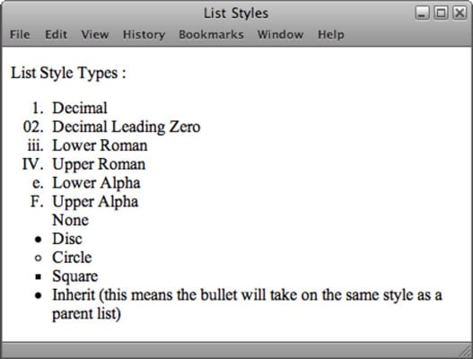
There are many ways to style the lists:
- Bullet Piont Styles
- Images for Bullets
- Positioning The Marker
- List Shorthand

Table Properties
- Border on Empty Cells
If you have empty cells in your table, then you can use the empty-cells property to specify whether or not their borders should be shown.
- show This shows the borders of any empty cells.
- hide This hides the borders of any empty cells.
- inherit If you have one table nested inside another, the inherit value instructs the table cells to obey the rules of the containing table.
- Gaps Between Cells
The border-spacing property allows you to control the distance between adjacent cells. By default, browsers often leave a small gap between each table cell, so if you want to increase or decrease this space then the border-spacing property allows you to control the gap.
- collapse Borders are collapsed into a single border where possible. (border-spacing will be ignored and cells pushed together, and empty-cells properties will be ignored.)
- separate Borders are detached from each other. (border-spacing and empty-cells will be obeyed.)
Styling Forms
Nobody I know enjoys filling in forms, so if you can make yours look more attractive and easier to use, more people are likely to fill it in. Also, when you come to look at a form in a few different browsers (as shown on the right), you will see that each browser displays them differently.
Styling Text Inputs
This example demonstrates the CSS properties commonly used with text inputs, most of which you have already met.
font-size sets the size of the text entered by the user.
color sets the text color, and background-color sets the background color of the input.
border adds a border around the edge of the input box, and border-radius can be used to create rounded corners (for browsers that support this property).
Styling Submit Buttons
Here are some properties that can be used to style submit buttons. This example builds on the one in the previous page, and the submit button inherits the styles set for the element on the last page.
color is used to change the color of the text on the button. text-shadow can give a 3D look to the text in browsers that support this property.
border-bottom has been used to make the bottom border of the button slightly thicker, which gives it a more 3D feel.
Styling Fieldsets & Legends
Fieldsets are particularly helpful in determining the edges of a form. In a long form they can help group together related information within it.
-
width is used to control the width of the fieldset. In this example, the width of the fieldset forces the form elements to wrap onto a new line in the correct place.
-
color is used to control the color of text.
-
background-color is used to change the color behind these items.
-
border is used to control the appearance of the border around the fieldset and/or legend.
-
border-radius is used to soften the edges of these elements in browsers that support this property.
-
padding can be used to add space inside these elements.
Aligning Form Controls: Problem
Labels for form elements are often different lengths, which means that the form controls will not appear in a straight line. This is demonstrated in the example on the right (without CSS applied to the form controls).
Aligning Form Controls: Solution
Each row of the form has a title telling users what they need to enter. For the text inputs, the title is in the <label> element. For the radio buttons, the title is in a <span> element. Both have a class attribute with a value of title.
Cursor Styles
The cursor property allows you to control the type of mouse cursor that should be displayed to users.
Here are the most commonly used values for this property:
- auto
- crosshair
- default
- pointer
- move
- text
- wait
- help
- url(“cursor.gif”)
Events
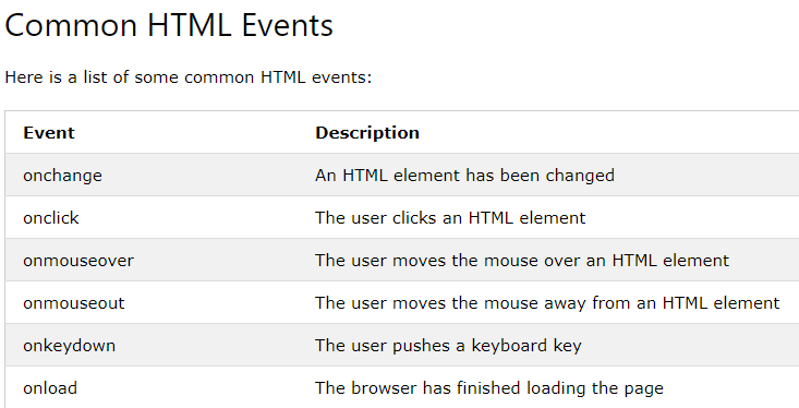
Here is a selection of the events that occur in the browser while you are browsing the web. Any of these events can be used to trigger a function in your JavaScript code.

How Events Trigger JavaScript Code
- Select t he element node(s) you want the script to respond to.
- Indicate which event on the selected node(s) will trigger the response.
- State the code you want to run when the event occurs.
THREE WAYS TO BIND AN EVENT TO AN ELEMENT
Event handlers let you indicate which event you are waiting for on any particular element. There are three types of event handlers.
- HTML EVENT HANDLERS
- TRADITIONAL DOM EVENT HANDLERS
- DOM LEVEL 2 EVENT LISTENERS
TRADITIONAL DOM EVENT HANDLERS
All modern browsers understand this way of creating an event handler, but you can only attach one function to each event handler.

SUPPORTING OLDER VERSIONS OF IE
IES-8 had a different event model and did not support addEventL i stener() but you can provide fallback code to make event listeners work with older versions of IE.
Event Flow
HRML elements nest inside other elements. If you hover or click on a link, you will also be hovering or clicking on its parent elements.
Why Flow Matters
The flow of events only really matters when your code has event handlers on an elemetn and one of its ancestor or descendant elements.
THE EVENT OBJECT
When an event occurs, the event object tells you information about the event, and the element it happened upon.
WHICH ELEMENT DID AN EVENT OCCUR ON?
When calling a function, the event object’s target property is the best way to determine which element the event occurred on. But you may see the approach below used; it relies on the this keyword.
THE this KEYWORD The this keyword refers to the owner of a function. On the right, this refers to the element that the event is on. This works when no parameters are being passed to the function.
DIFFERENT TYPES OF EVENTS
- W3C DOM EVENTS
The DOM events specification is managed by the W3C (who also look after other specifications including HTML, CSS, and XML). Most of the events you will meet in this chapter are part of this DOM events specification.
- HTM LS EVENTS
The HTMLS specification (that is still being developed) details events that browsers are expected to support that are specifically used with HTML.
- BOM EVENTS
Browser manufacturers also implement some events as part of their Browser Object Model (or BOM). Typically these are events not (yet) covered by W3C specifications.
USER INTERFACE EVENTS
User interface CUI) events occur as a result of interaction with the browser window rather than the HTML page contained within it, e.g., a page having loaded or the browser window being resized.
Where Events Occur
The event object can tell you where the cursor was positioned when an event was triggered.